
Multimedia trainer Anne Medley took gear and a whole new way of thinking to eager learners.

Editor-in-Chief Jon Weber readies the Bay Citizen for launch with a multimedia approach to serving the Bay Area.
MJR staff rated the best national and Montana-based newspaper websites. Here’s how they stack up.
Newspapers cannot change fast enough, and yet they must not abandon their civic and democratic functions to the whims of the Internet.

Multimedia can function at its highest level in telling huge, complicated stories.
It’s all about the storytelling.

Partners bring different strengths to the table.

Websites are becoming an integral part of newspapers, especially when it comes to furthering multimedia capabilities. We at MJR decided it would be interesting to see where both national and local papers’ sites stacked up next to each other. While the national papers, with their much larger staffs, ranked above the Montana papers, the difference between the top Montana site (The Flathead Beacon) and the lowest ranking national site (San Francisco Chronicle,), was only a tenth of a point.
We decided to look at some key criteria that, together, determine how reader-friendly a newspaper website is. We looked at the layout of the front page, overall site design, font choice readability, background color readability, ad distraction, navigability of the site, multimedia content, balance of national and local news and total load time of site, which were all scored on a scale of one (horrible) to 10 (great). We also chose to show what different features the site has: the ability to change the font size, headlines or summaries on the front page, story sharing capabilities and requirement of registering for comments.
 National Papers:
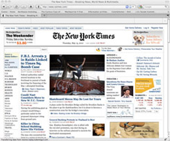
#1 The New York Times www.nytimes.com
TOTAL: 8.13
The New York Times won our top spot by scoring high in navigability and loading speed. It also got marks for not having distracting ads. It loses some points for not being able to change the font size and it suffers some from design issues.
Layout: 7.5
Design: 7.4
Font: 8.1
Background color: 8.1
Ad distraction: 8.4
Navigability: 8.3
Multimedia content: 8.3
Balance: 8.1
Load time: 9
Font size changeability: No
Headlines or summaries: Summaries
Story sharing: Yes
Register for comments: Yes

#2 USA Today www.usatoday.com
TOTAL: 8.03
USA Today only lost by a 10th of a point, but it lost because of distracting advertisements. Maybe next time it’ll tone down the extras and focus on content.
Layout: 8.1
Design: 8.1
Font: 8.1
Background color: 8.6
Ad distraction: 6.6
Navigability: 8.5
Multimedia content: 8.2
Balance: 7.7
Load time: 8.5
Font size changeability: No
Headlines or summaries: Headlines
Story sharing: Yes
Register for comments: Yes
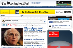
#3 The Washington Post www.washingtonpost.com
TOTAL: 7.77
The Washington Post scored pretty average on all scores, which means it just didn’t stand out enough to move up.
Layout: 7.3
Design: 7.1
Font: 7.9
Background color: 7.9
Ad distraction: 7.7
Navigability: 7.9
Multimedia content: 7.8
Balance: 8.1
Load time: 8.2
Font size changeability: Yes
Headlines or summaries: Summaries
Story sharing: Yes
Register for comments: Yes

#4 The Chicago Tribune www.chicagotribune.com
TOTAL: 7.59
The Chicago Tribune scored fourth due to a poorly designed layout. Its balance was great, it just needed more on the aesthetic side.
Layout: 7.1
Design: 7.3
Font: 8.0
Background color: 8.5
Ad distraction: 6.3
Navigability: 7.9
Multimedia content: 7.1
Balance: 8.3
Load time: 8.4
Font size changeability: Yes
Headlines or summaries: Headlines
Story sharing: Yes
Register for comments: No

#5 San Francisco Chronicle www.sfgate.com
TOTAL: 7.58
The San Francisco Chronicle lost to the Tribune by only a hundredth of a point. It scored highest out of all papers on layout, but its total design is where it dropped the ball.
Layout: 7.8
Design: 6.9
Font: 7.8
Background color: 7.6
Ad distraction: 6.4
Navigability: 7.8
Multimedia content: 7.1
Balance: 8.3
Load time: 8.5
Font size changeability: Yes
Headlines or summaries: Headlines
Story sharing: Yes
Register for comments: Yes

Montana papers:
#1 The Flathead Beacon www.flatheadbeacon.com
TOTAL: 7.48
What really pushed the Flathead Beacon over the edge was their multimedia content, though they also did well with the rest of the criteria.
Layout: 6.8
Design: 7.7
Font: 7.6
Background color: 8.1
Ad distraction: 7.3
Navigability: 7.2
Multimedia content: 7.4
Balance: 6.9
Load time: 8.3
Font size changeability: No
Headlines or summaries: Headlines
Story sharing: Yes
Register for comments: Yes

#2 Missoulian www.missoulian.com
TOTAL: 7.02
The Missoulian just didn’t have enough balance on the site to beat out the Beacon for the top spot.
Layout: 6.6
Design: 6.1
Font: 7.5
Background color: 7.6
Ad distraction: 5.9
Navigability: 7.1
Multimedia content: 6.2
Balance: 7.5
Load time: 8.1
Font size changeability: Yes
Headlines or summaries: Headlines
Story sharing: Yes
Register for comments: Yes

#3 Bozeman Daily Chronicle www.bozemandailychronicle.com
TOTAL: 6.84
The Chronicle was pretty average until we got to the multimedia content, which was sadly lacking.
Layout: 6.6
Design: 6.6
Font: 7.4
Background color: 7.3
Ad distraction: 6.5
Navigability: 7.1
Multimedia content: 5.9
Balance: 6.6
Load time: 7.6
Font size changeability: Yes
Headlines or summaries: Summaries
Story sharing: Yes
Register for comments: Yes

#4 Great Falls Tribune www.greatfallstribune.com
TOTAL: 6.79
The Tribune’s balance of content was really good, but they lost it on their layout. It’s all about packaging.
Layout: 6.1
Design: 6.3
Font: 6.8
Background color: 7.7
Ad distraction: 5.9
Navigability: 6.9
Multimedia content: 6.1
Balance: 7.4
Load time: 6.9
Font size changeability: Yes
Headlines or summaries: Headlines
Story sharing: Code wasn’t working
Register for comments: No

#5 Lewistown News-Argus www.lewistownnews.com
TOTAL: 6.70
The News-Argus may have rivaled the Beacon in terms of overall design, but they have terrible multimedia content. Stepping that up might just move them up on our list from last place.
Layout: 6.5
Design: 7.7
Font: 6.6
Background color: 7.1
Ad distraction: 7.0
Navigability: 6.8
Multimedia content: 4.2
Balance: 5.6
Load time: 7.9
Font size changeability: Yes
Headlines or summaries: Headlines
Story sharing: No
Register for comments: Yes
©2010 Montana Journalism Review. All Rights Reserved